A Powerviz Sankey chart is a flow diagram that visualizes the proportional movement of data, resources, or processes between different categories or stages, using weighted flows to represent the magnitude of connections. It includes vertical and horizontal charts, adding multiple levels, highlighting and moving nodes, fill patterns, 30+ color palettes, conditional formatting, image labels, import/export and many more.
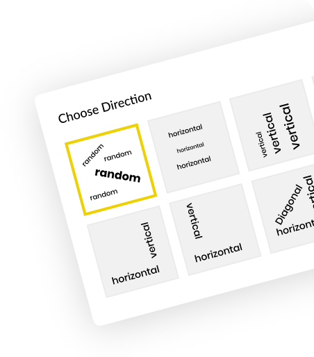
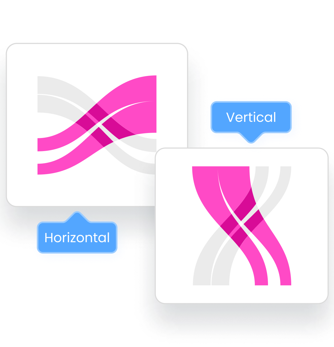
Easily switch between Vertical and Horizontal chart styles in a single click.
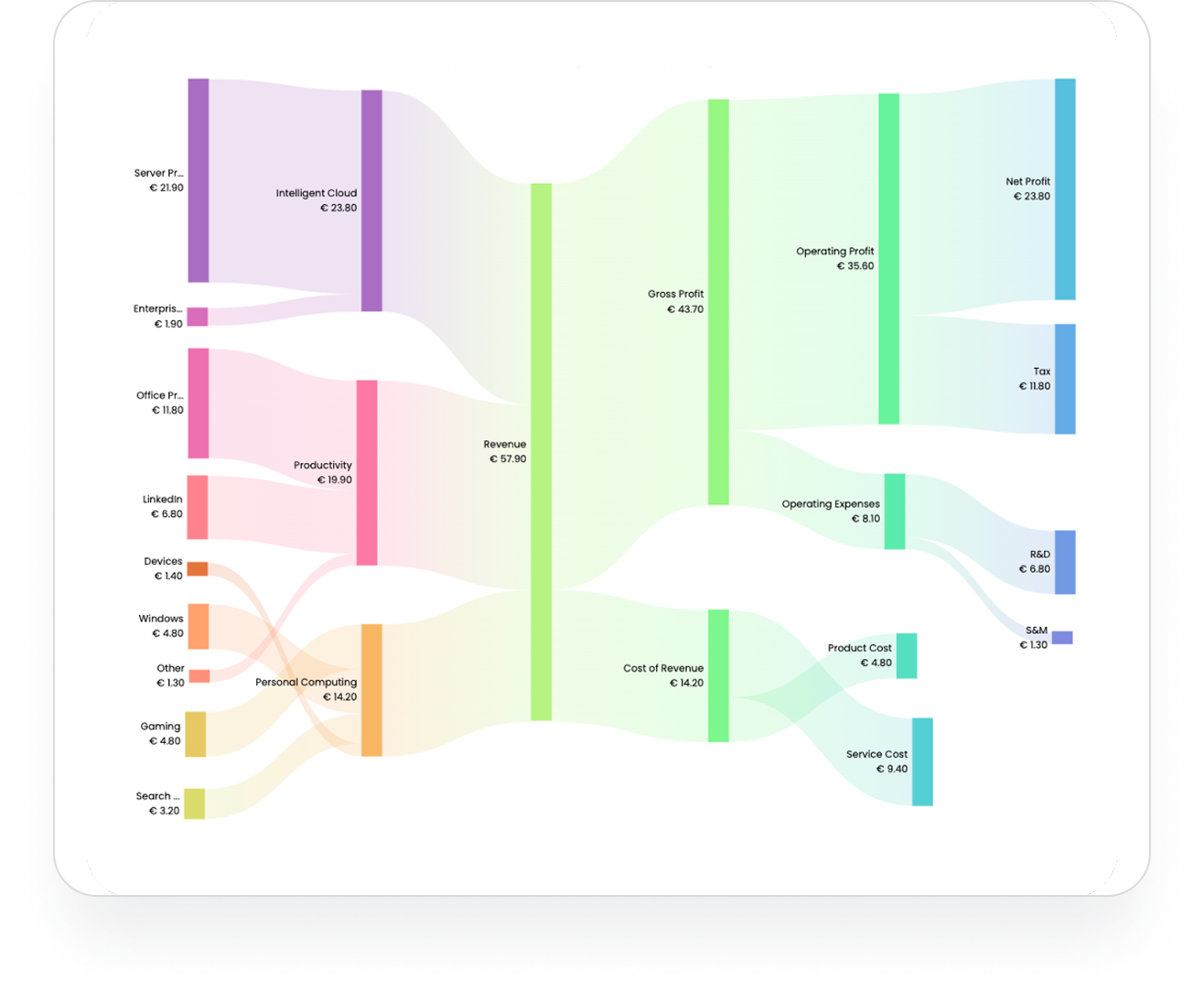
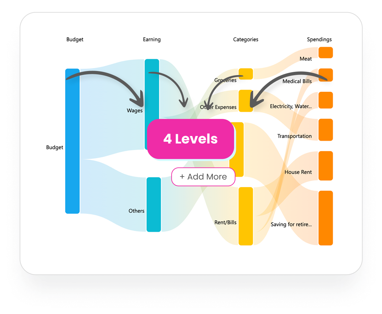
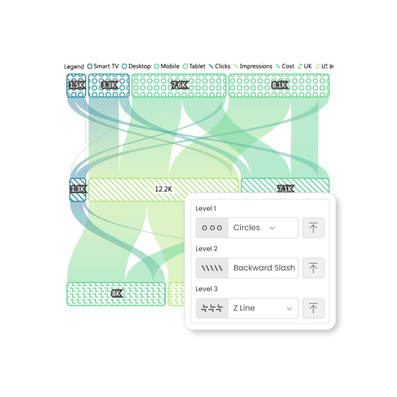
Add multiple level to your Sankey Chart to get better insights.
30+ color palettes, including accessibility-safe options, with the flexibility to add colors to nodes or links individually.

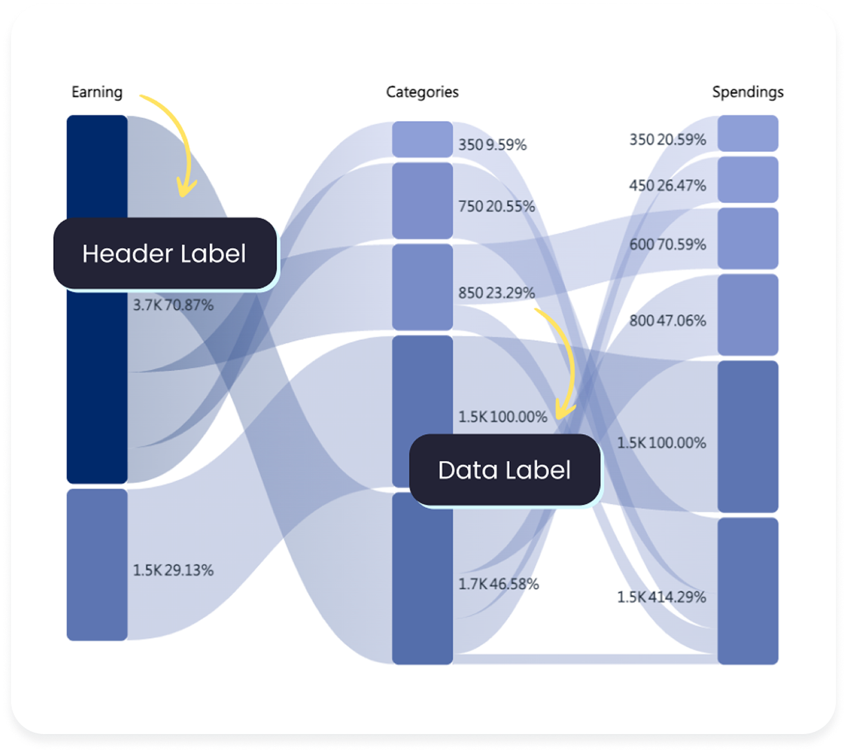
Add Data labels and Header labels with customization options to improve readability.
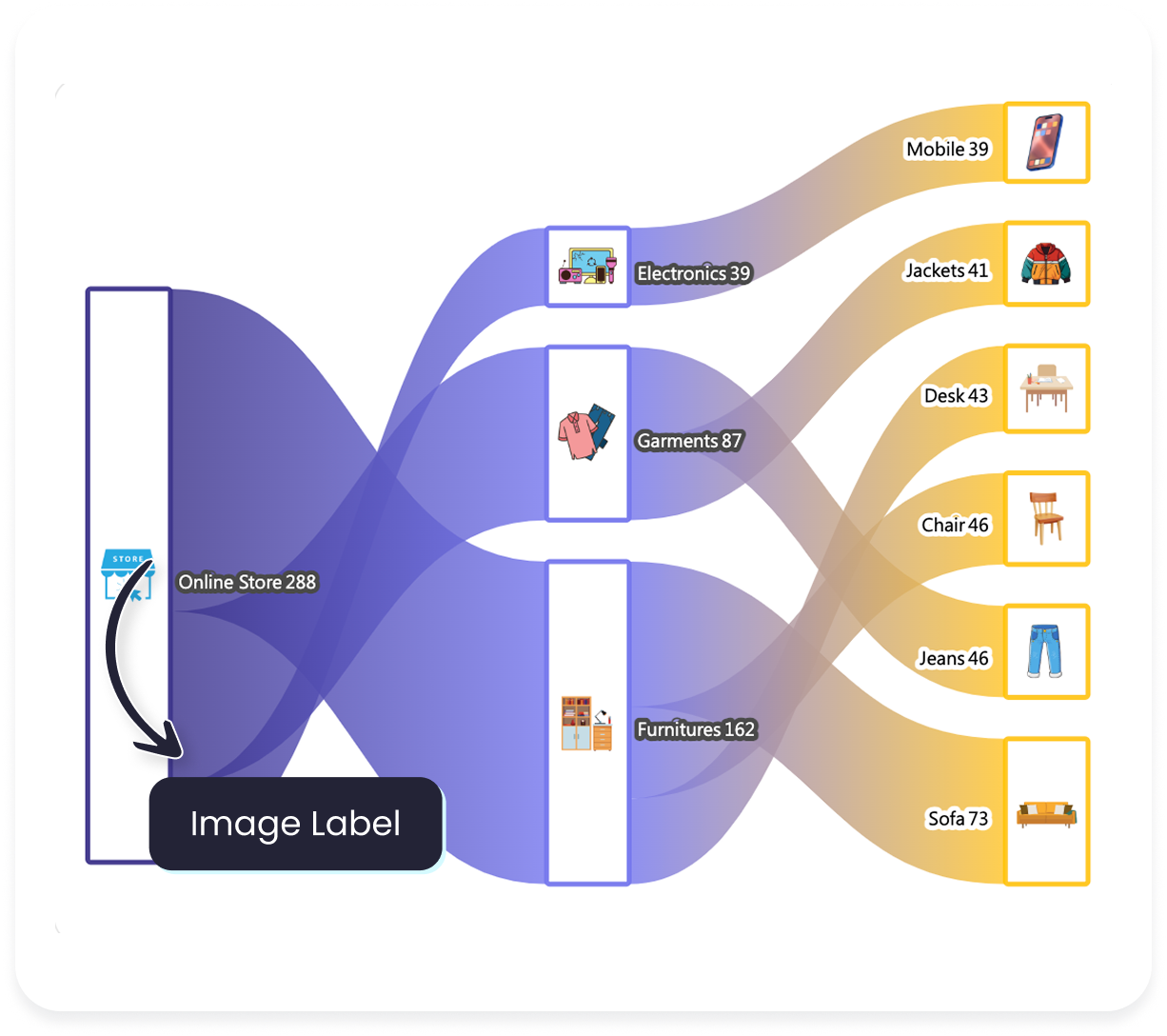
Add images both inside and outside the chart to improve its interpretability.
Choose from a wide range of pre-designed patterns or upload your own design.
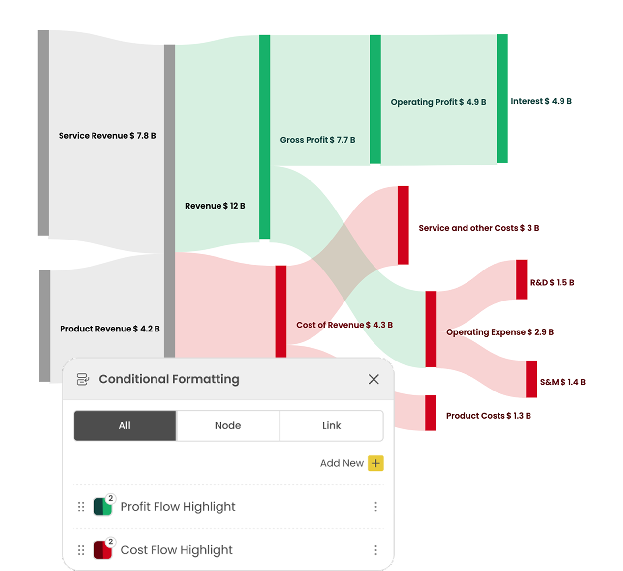
Identify Outliers effortlessly based on value or category.