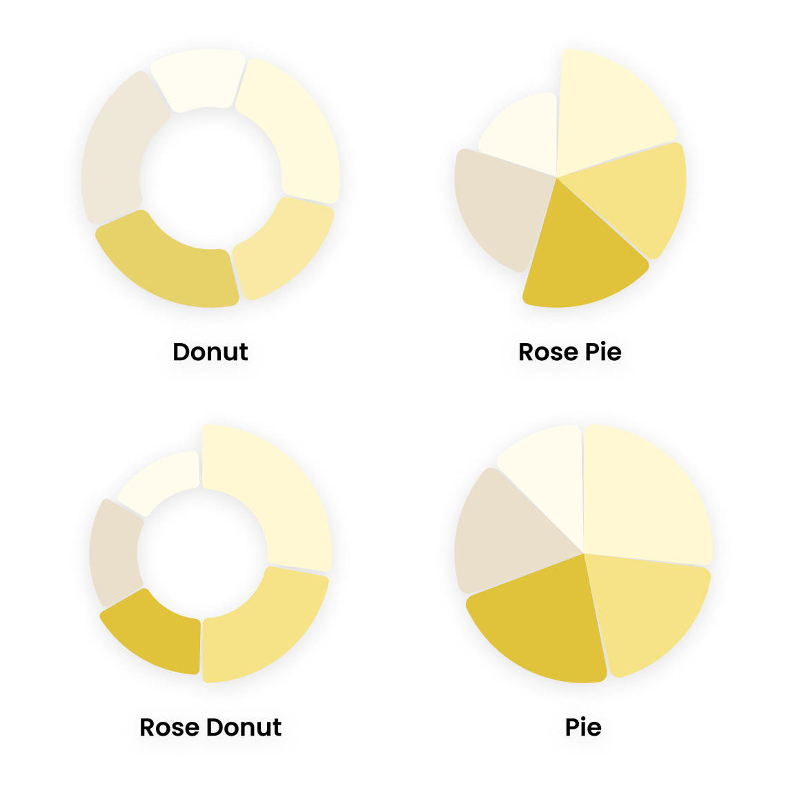
The Powerviz Rose/Donut/Pie chart is an advanced visual that comes with many advanced features. In one chart you get four variations: the Rose chart, Rose Donut chart, Donut chart, and Pie chart. Pie and Donut charts show different parts of a whole, where each slice represents a different category. The Rose chart/Variable chart, gives each slice a different size, creating a shape like a rose flower. These charts help make it easier to look at data and understand it.
The Powerviz Rose/Donut/Pie chart consists of four different chart types within one visual.
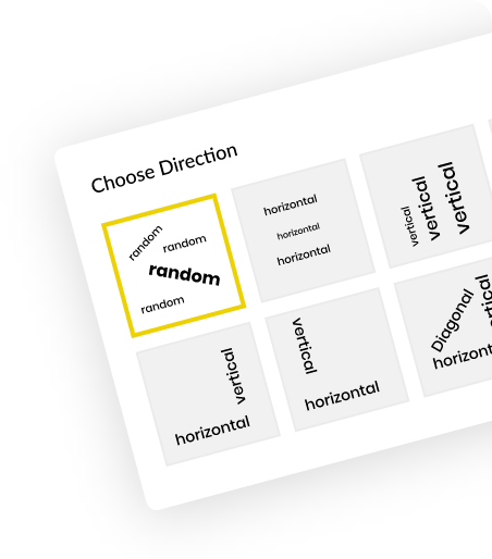
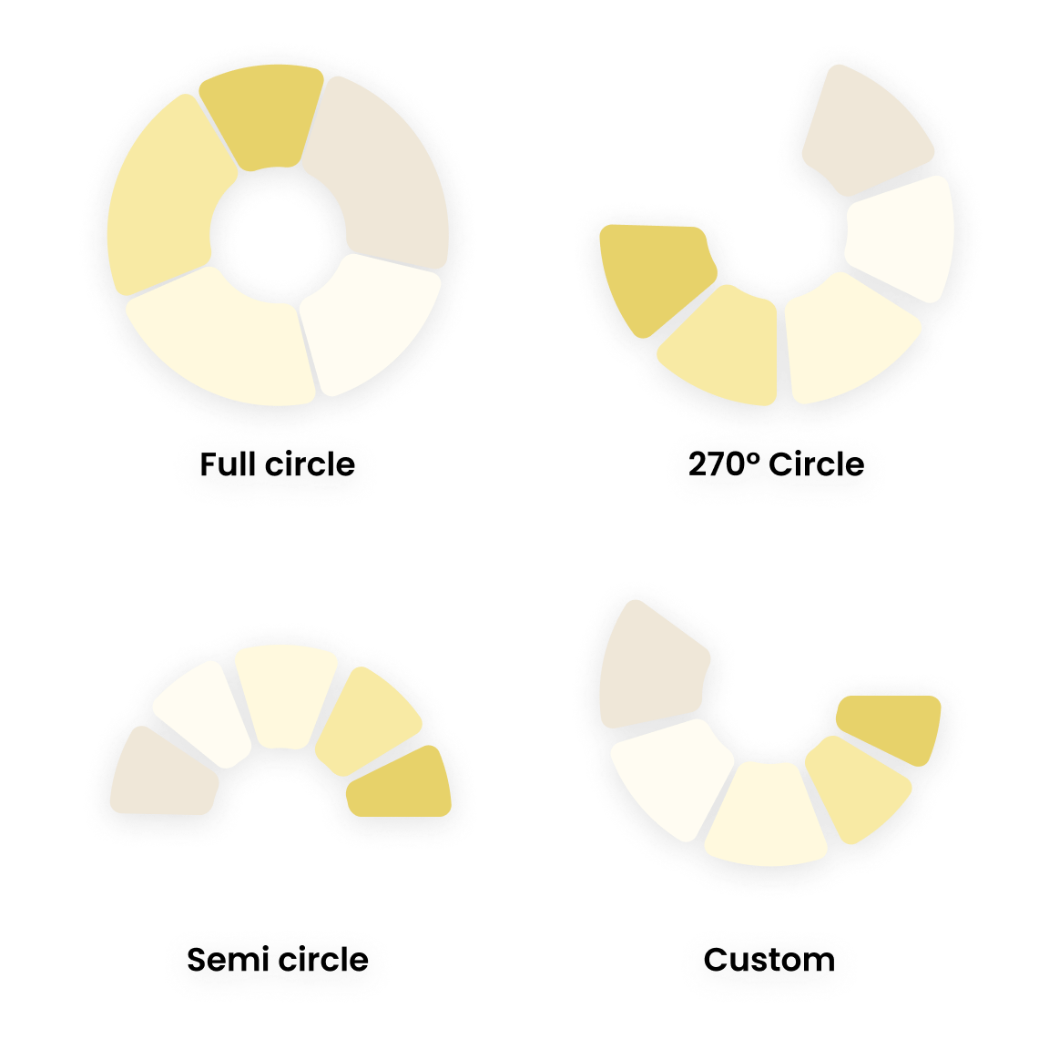
Variety of Chart Styles Powerviz gives you flexibility to change the display style to any custom angle.
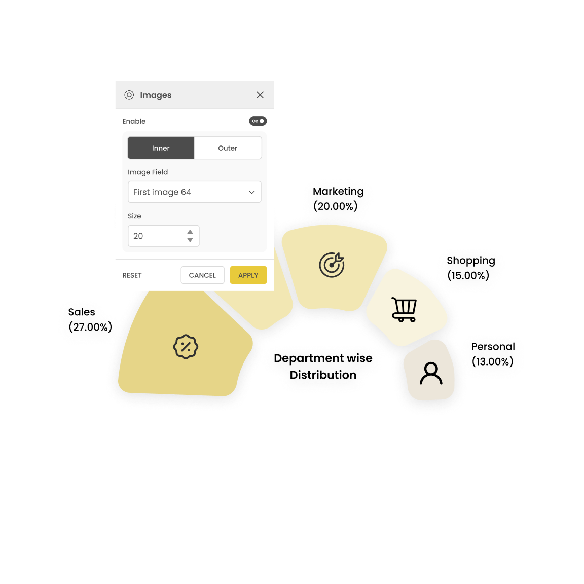
Rose/Donut/Pie chart allows you to add images both inside and around the chart to improve its interpretability.
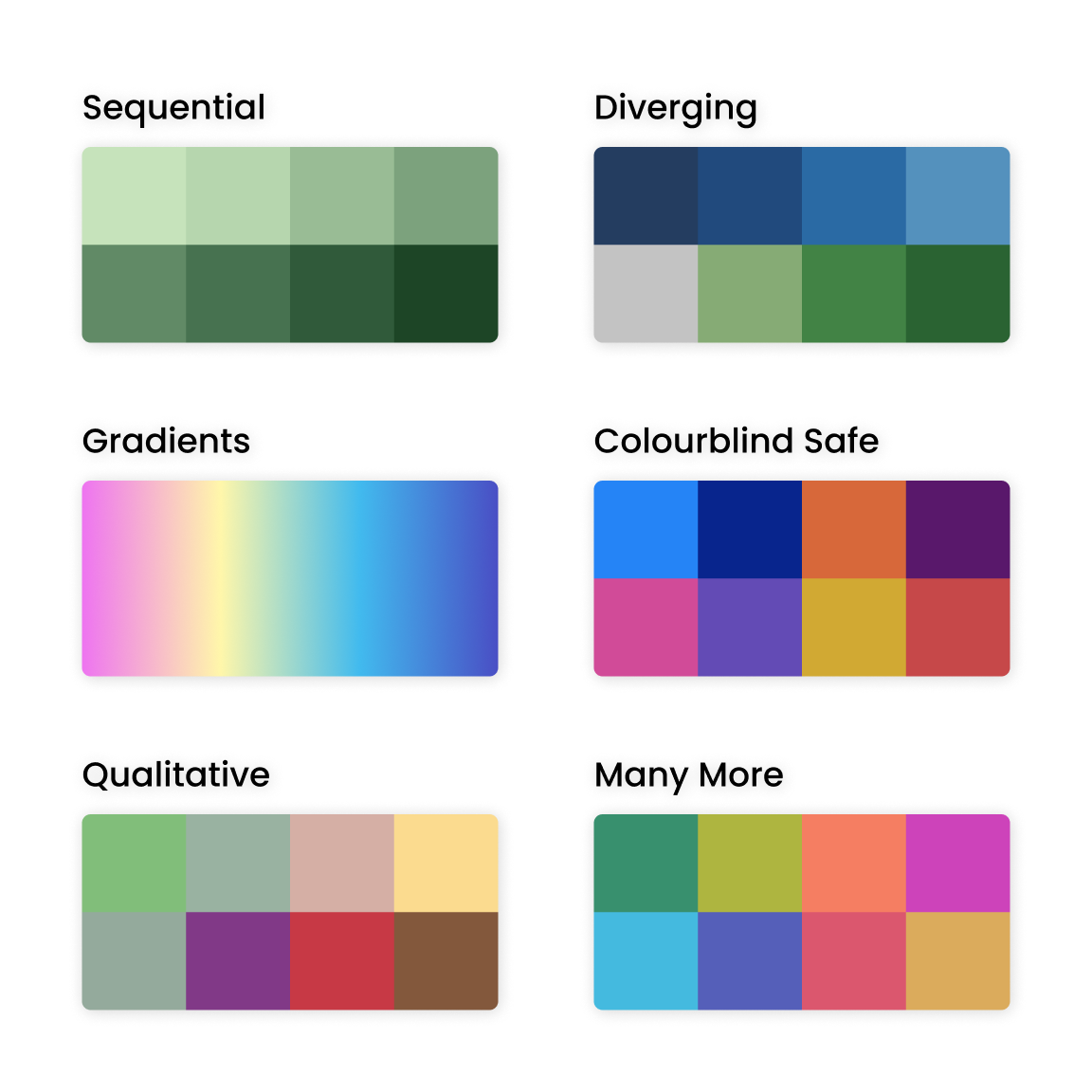
Powerviz offers multiple color schemes and more than 30 color palettes to choose from. For accessibility, there are also colorblind-safe palettes available.
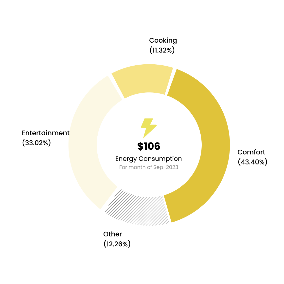
Use a combination of text, measure, icon, and uploaded images to style the center area of the Rose/Donut/Pie chart.
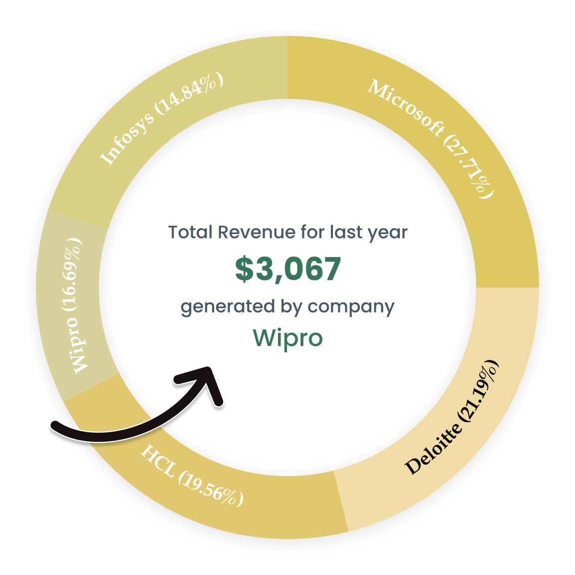
Powerviz allows the user to see dynamic details in the center by hovering over the arcs.

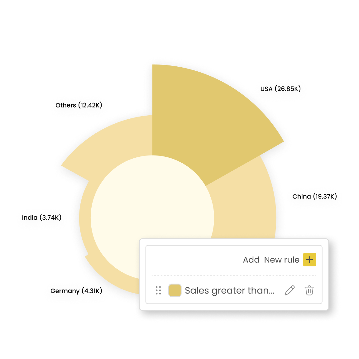
Effortlessly spot outliers with the measure or category rules, no DAX required! Powerviz provides conditional formatting based on Value, Ranking, and percentage.
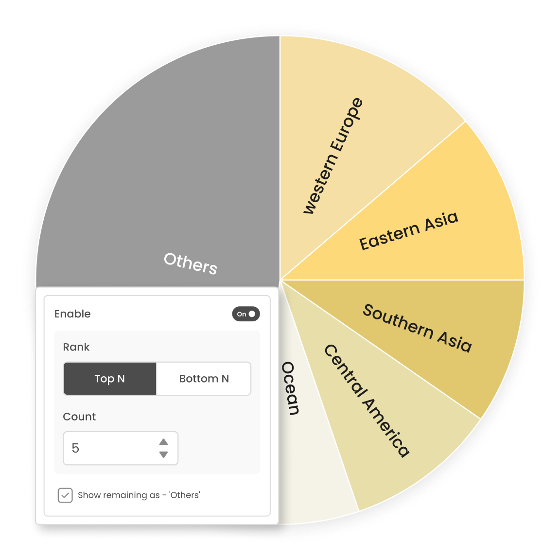
Filter out Top/Bottom N by each level. Either hide or show the remaining categories as "Others".