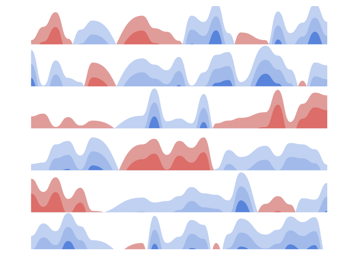
Powerviz Horizon Chart is an advanced visual, used to display time-series data, making it easier to identify trends, anomalies, and patterns. It displays stacked data layers, allowing users to compare multiple categories while maintaining data clarity. Horizon Charts are particularly useful to monitor and analyze complex data over time, making this a valuable visual for data analysis and decision-making.
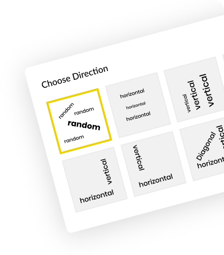
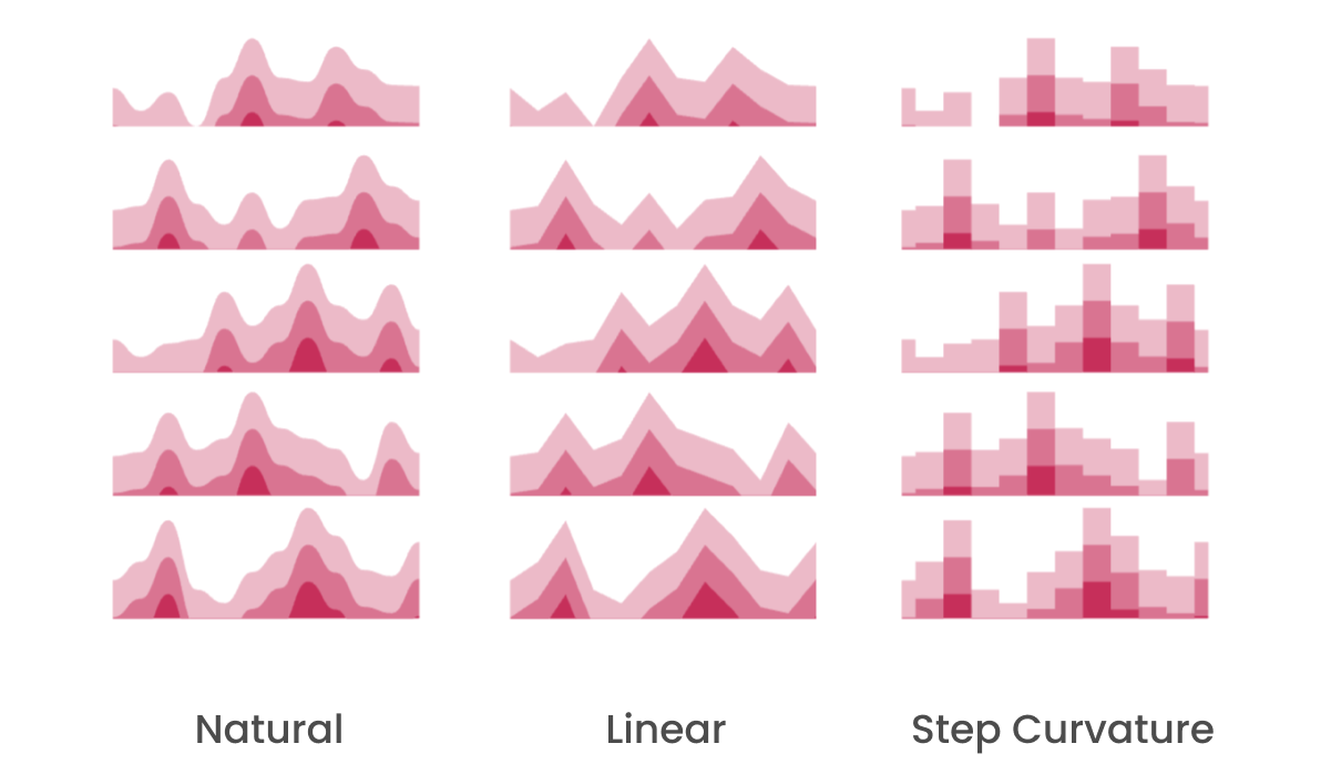
Style your Horizon chart into different designs to make it more visually appealing.
Control the number of layers along with Advanced customization for Negative Values.

Add lines on the X-axis to highlight a range or a data point.
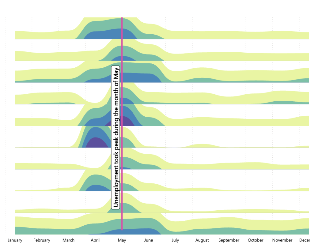
Improve analysis with our custom tooltip, showcasing the highest, lowest, mean, and median values.

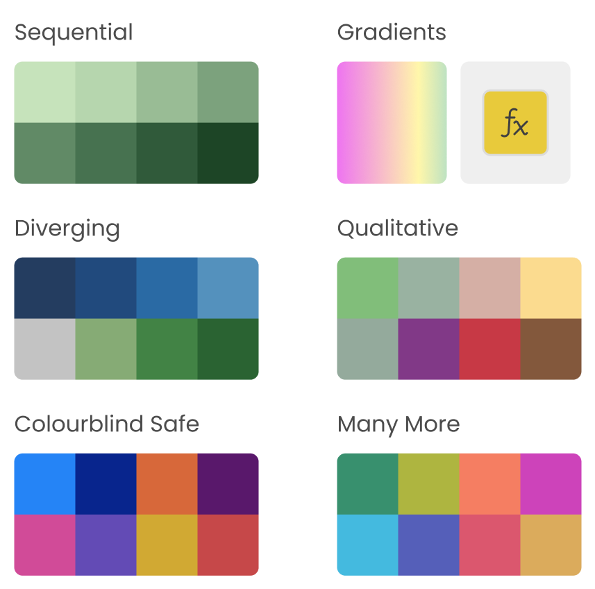
Enhance your visuals with multiple color options. Choose from a wide range of options, including six color schemes and over 30 stunning palettes. Additionally, apply conditional formatting rules.
What better way to highlight a pattern than with the pattern itself? Choose from a wide range of pre-designed patterns or upload your own design.

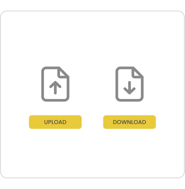
Easily save your designs using the JSON export/import feature, enabling seamless sharing and use across multiple Power BI reports.