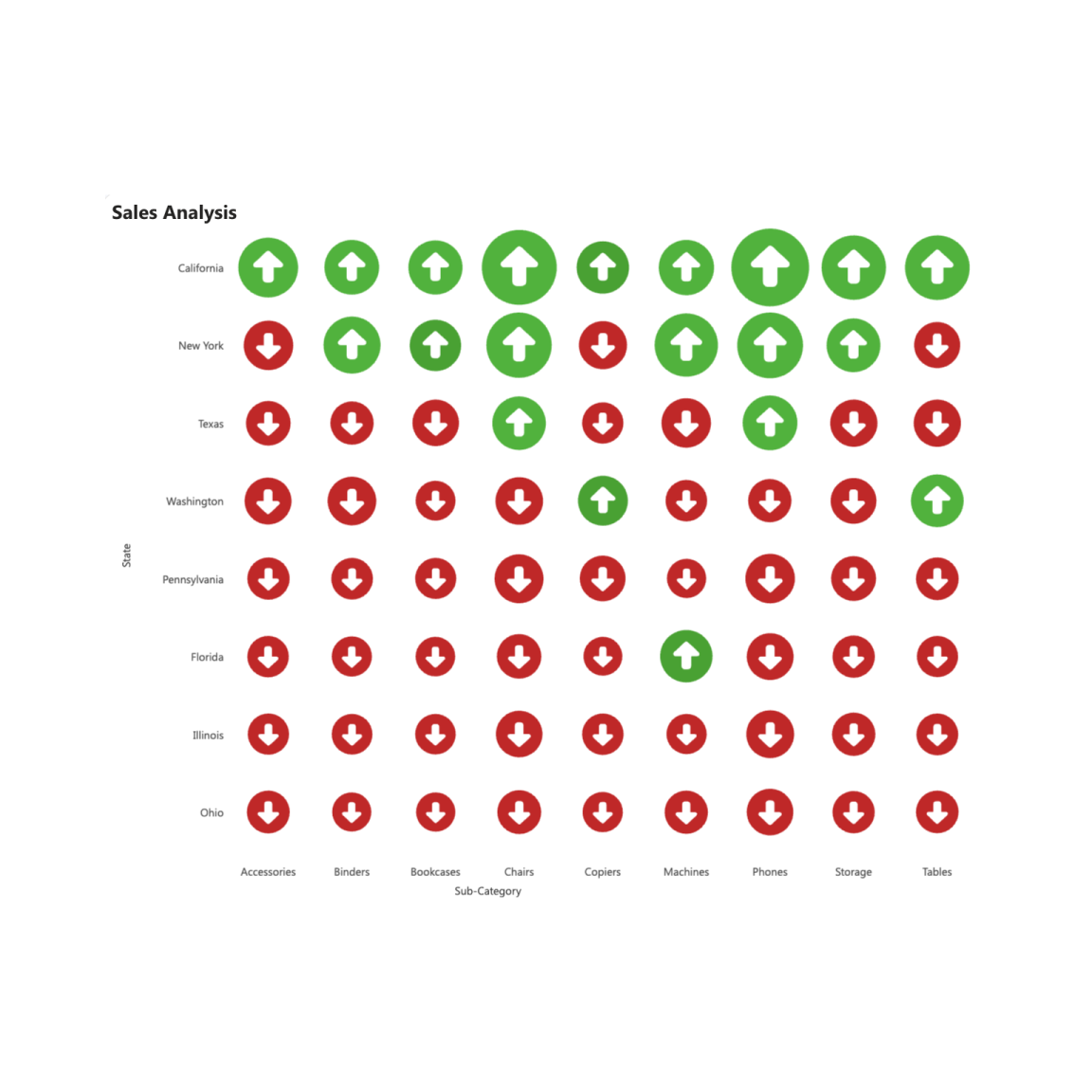
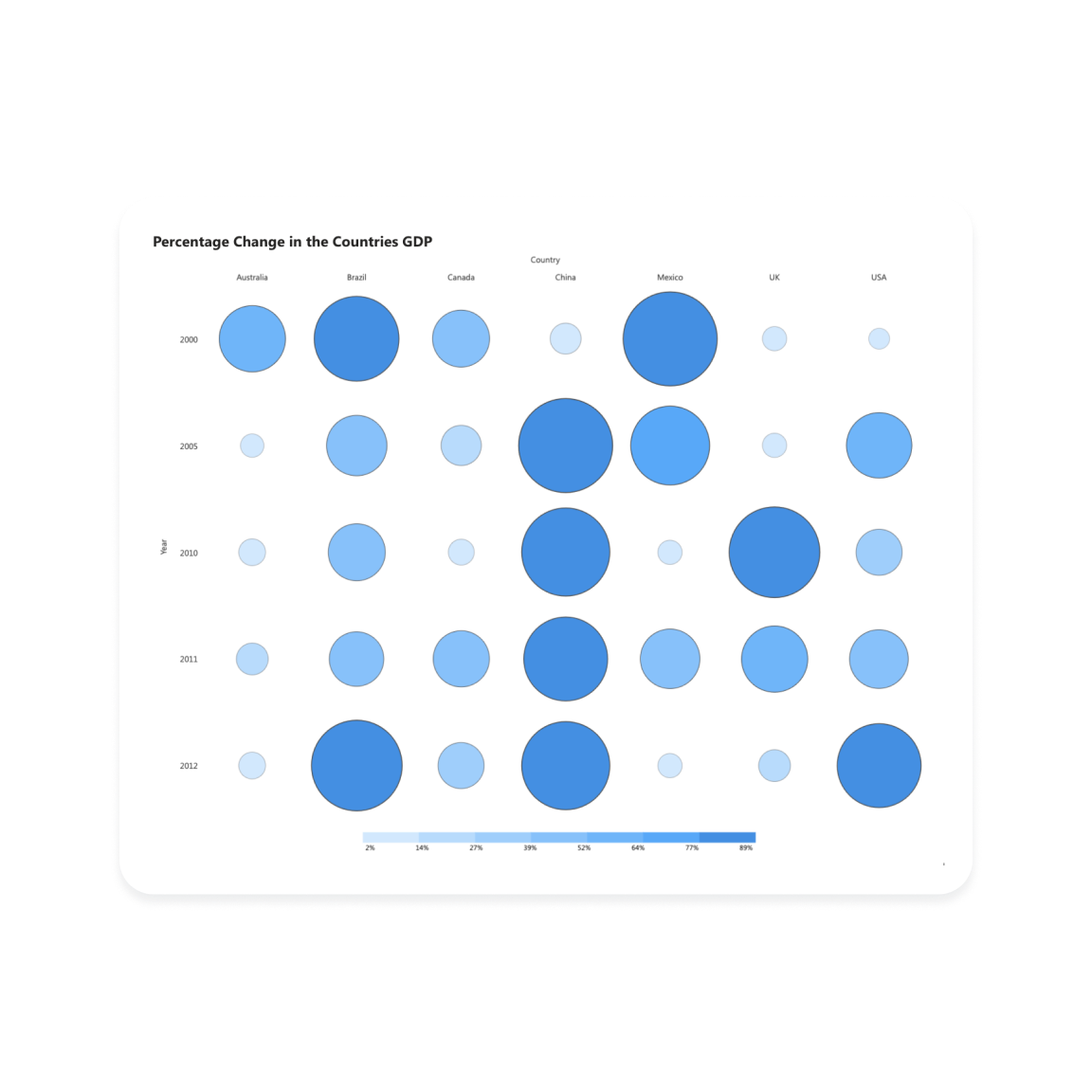
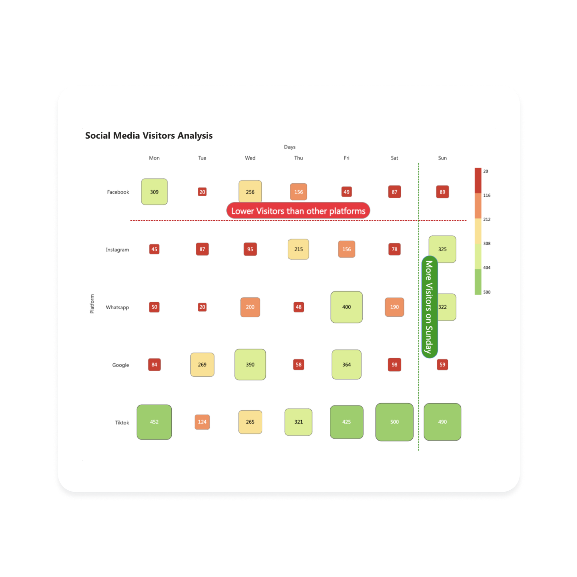
A heatmap is a visual representation that uses a matrix format to display values, helping to identify correlations between two categories. It is widely used because it effectively illustrates variations through color gradients. Adjusting the size and shape of the cells can enhance the visibility of patterns in the heatmap.
Unleash boundless creativity with Powerviz’s versatile Heatmap generation
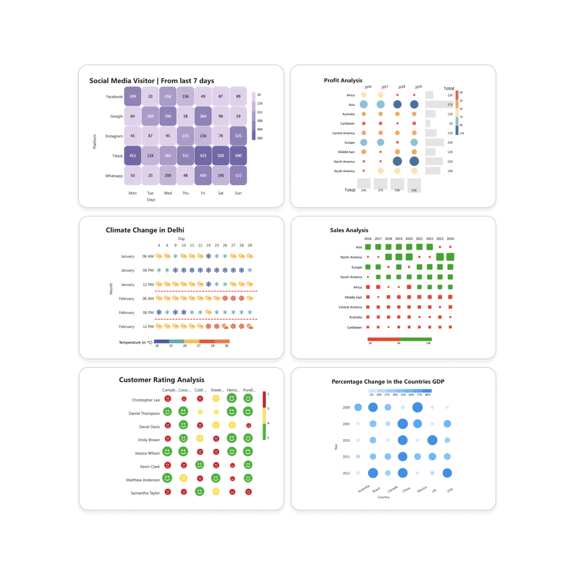
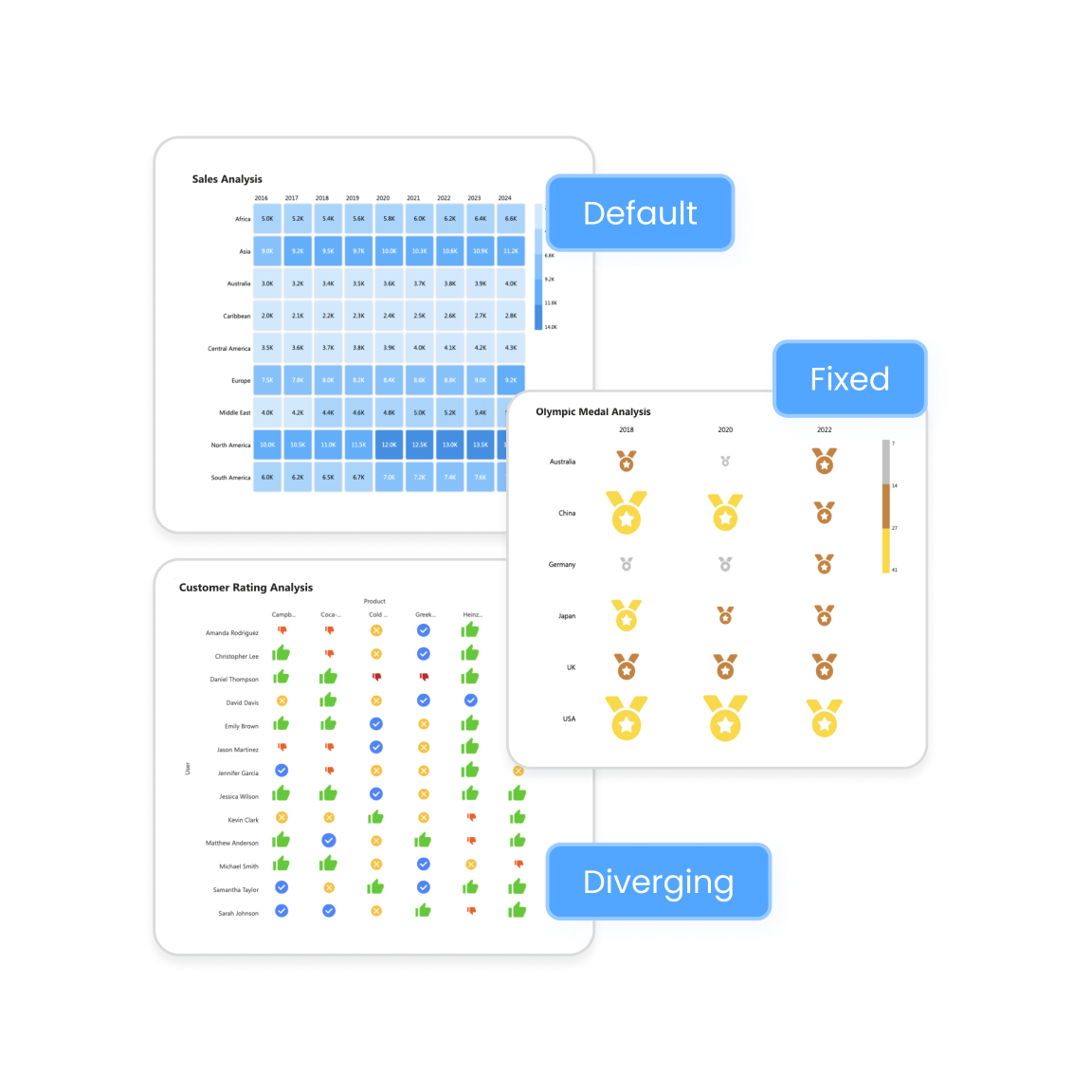
Enhance your heatmap using different shapes, such as Default, Fixed, and Diverging types to improve its appearance and clarity.
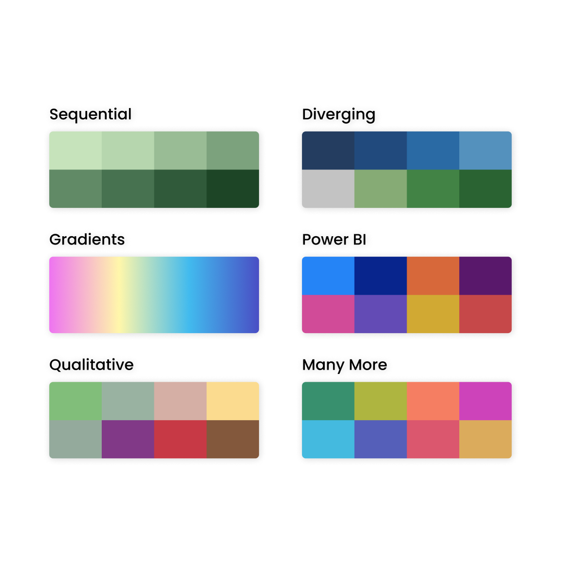
30+ color palettes, including accessibility-safe options, with the flexibility to add colors by data classes or using a custom color field.
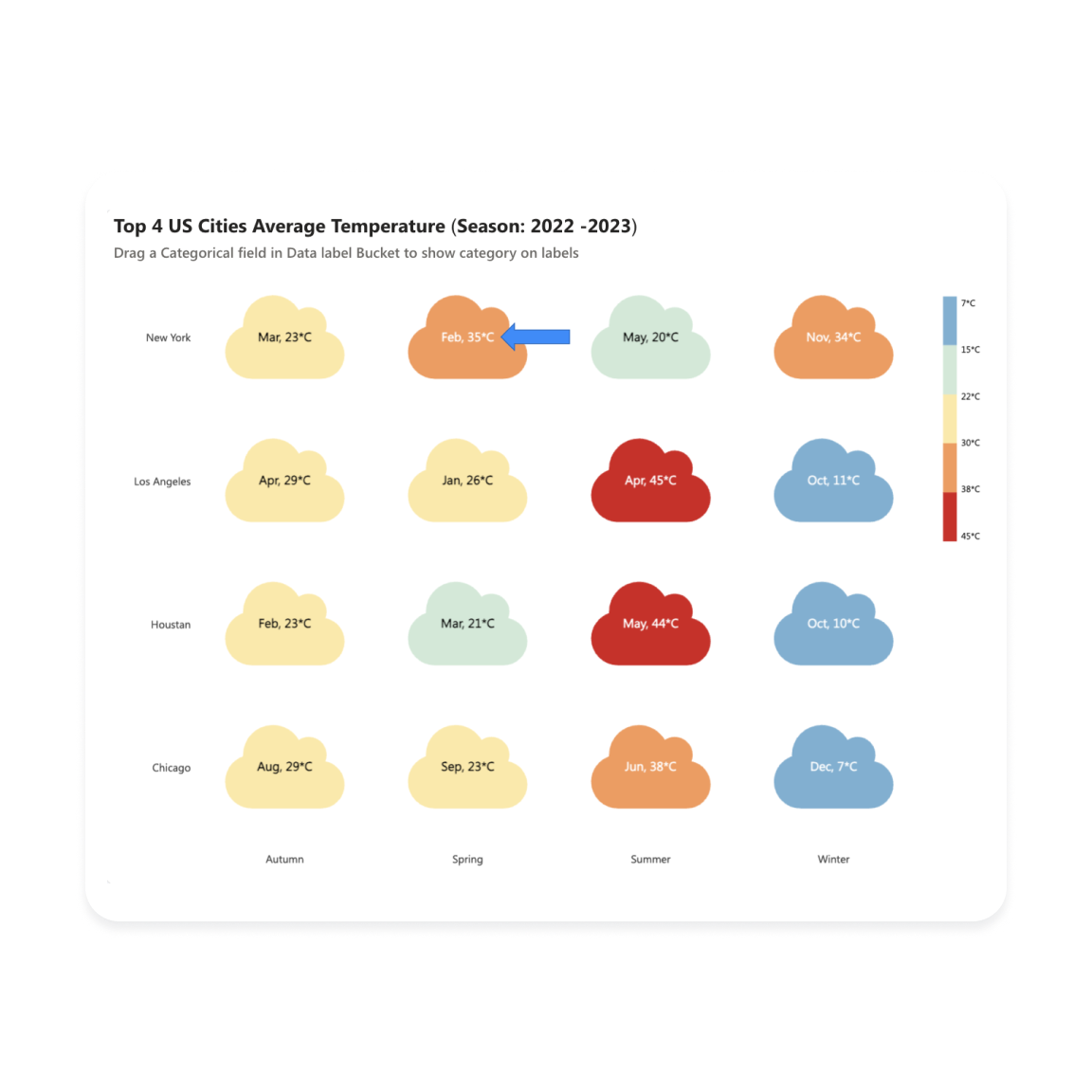
Choose from 3 display styles or add custom data labels with formatting options to customize the labels.
Plot lines on the Y-axis and X-axis to highlight a range or important points of an event.
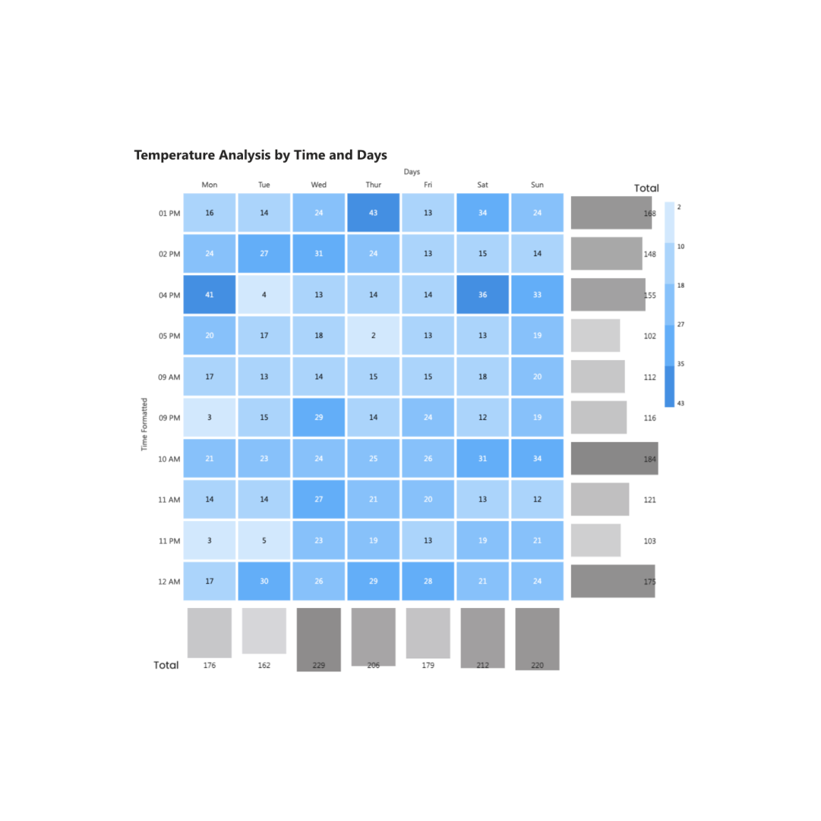
Add total values on rows and columns with bars using advanced customization options.
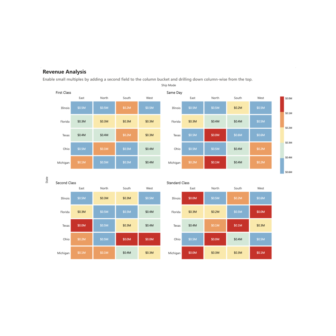
Split your visual into multiple, smaller visuals based on your selected fields.
Identify Outliers Effortlessly based on value or category.
