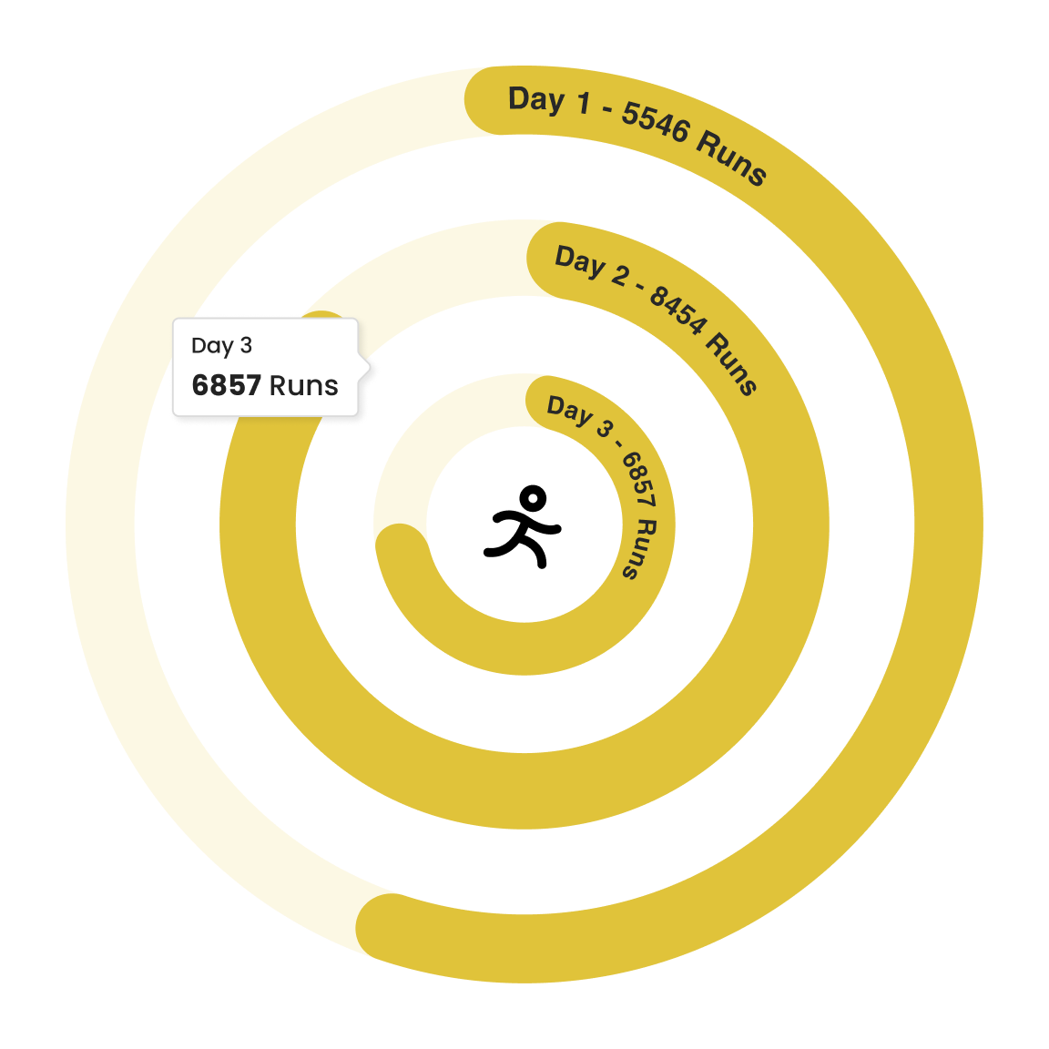
The Powerviz Activity Gauge is an advanced visual that uses circular-shaped bars to compare multiple categories. It quickly shows the current status or progress of an activity compared to the target, allowing users to understand the data at a glance. With Powerviz, You can customize its shape, style, and labels, and even set custom targets.
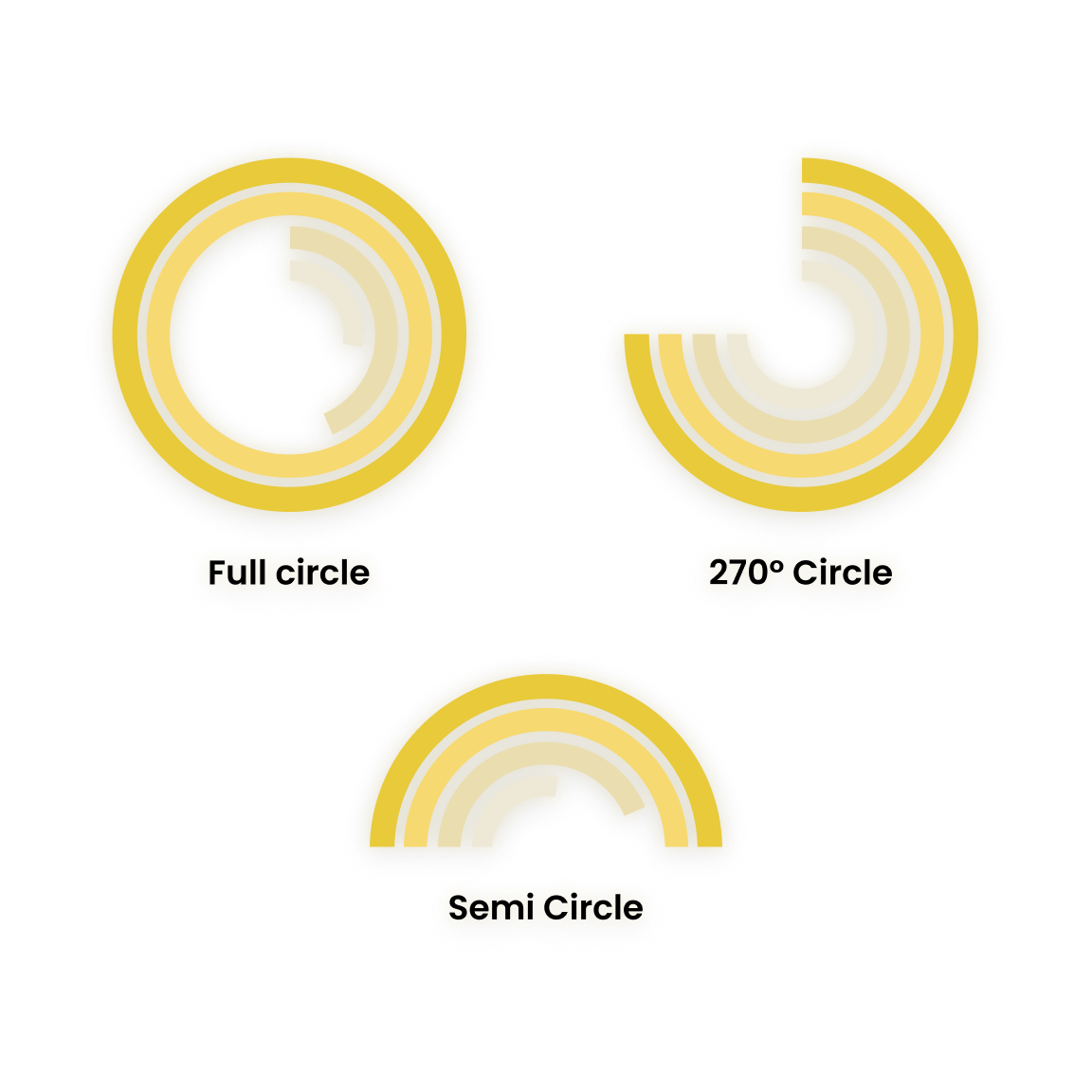
Variety of Arc Styles: Powerviz allows you to change display style to any custom angle.
Set custom target from using a field or given list of options.
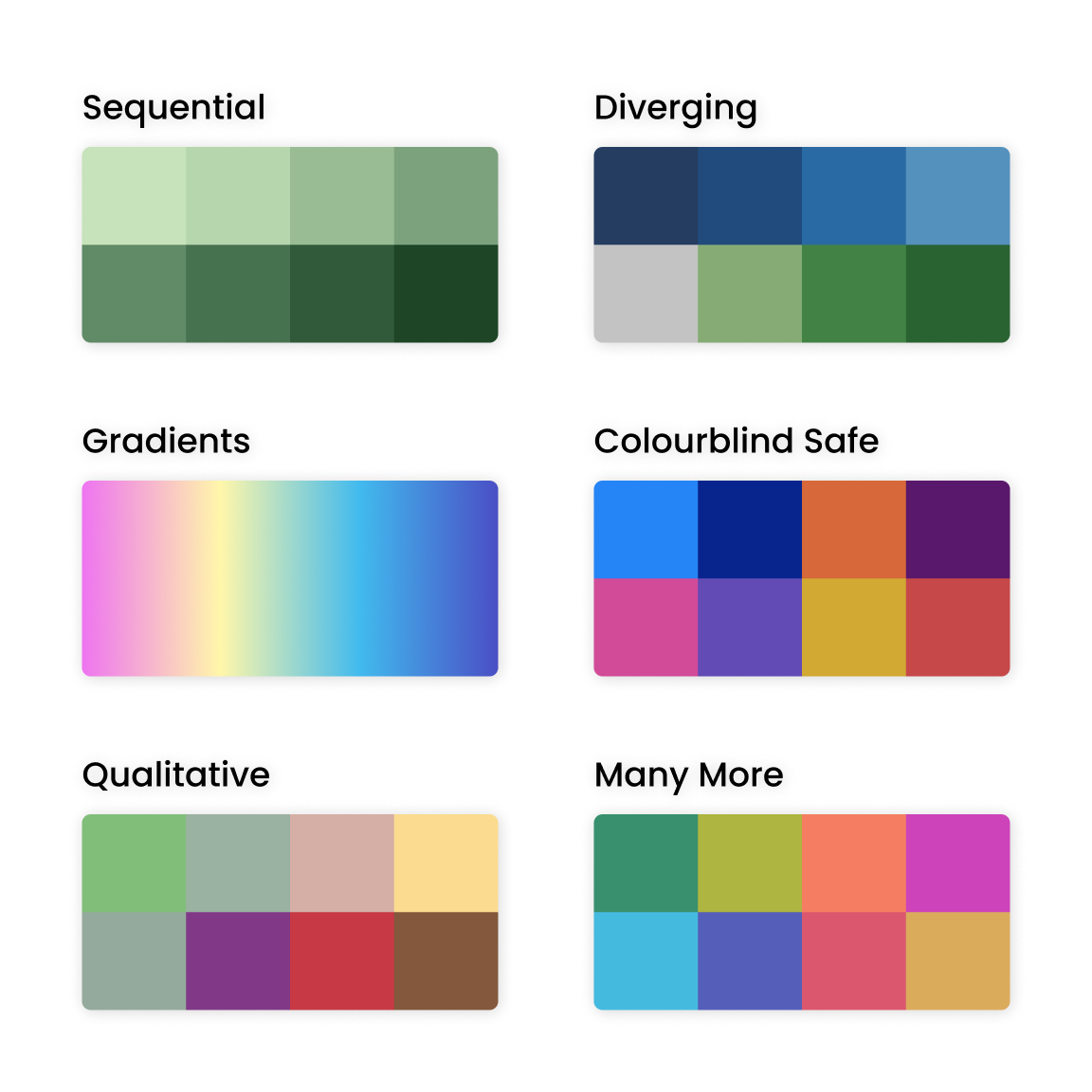
Powerviz offers multiple color schemes and more than 30 color palettes to choose from. For accessibility, there are also colorblind-safe palettes available.
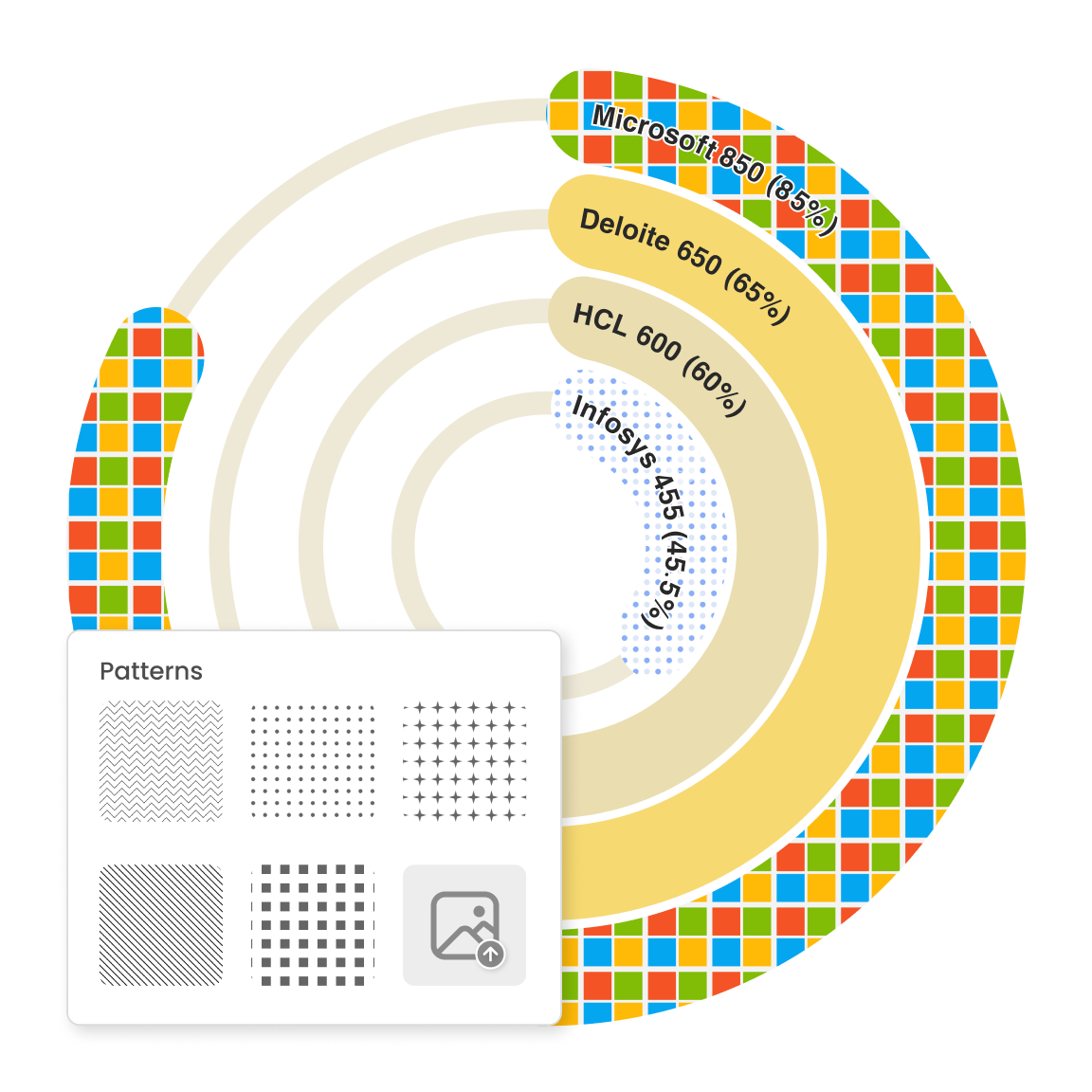
Powerviz gives you the flexibility to apply patterns by picking from a wide range of options or adding your own image.
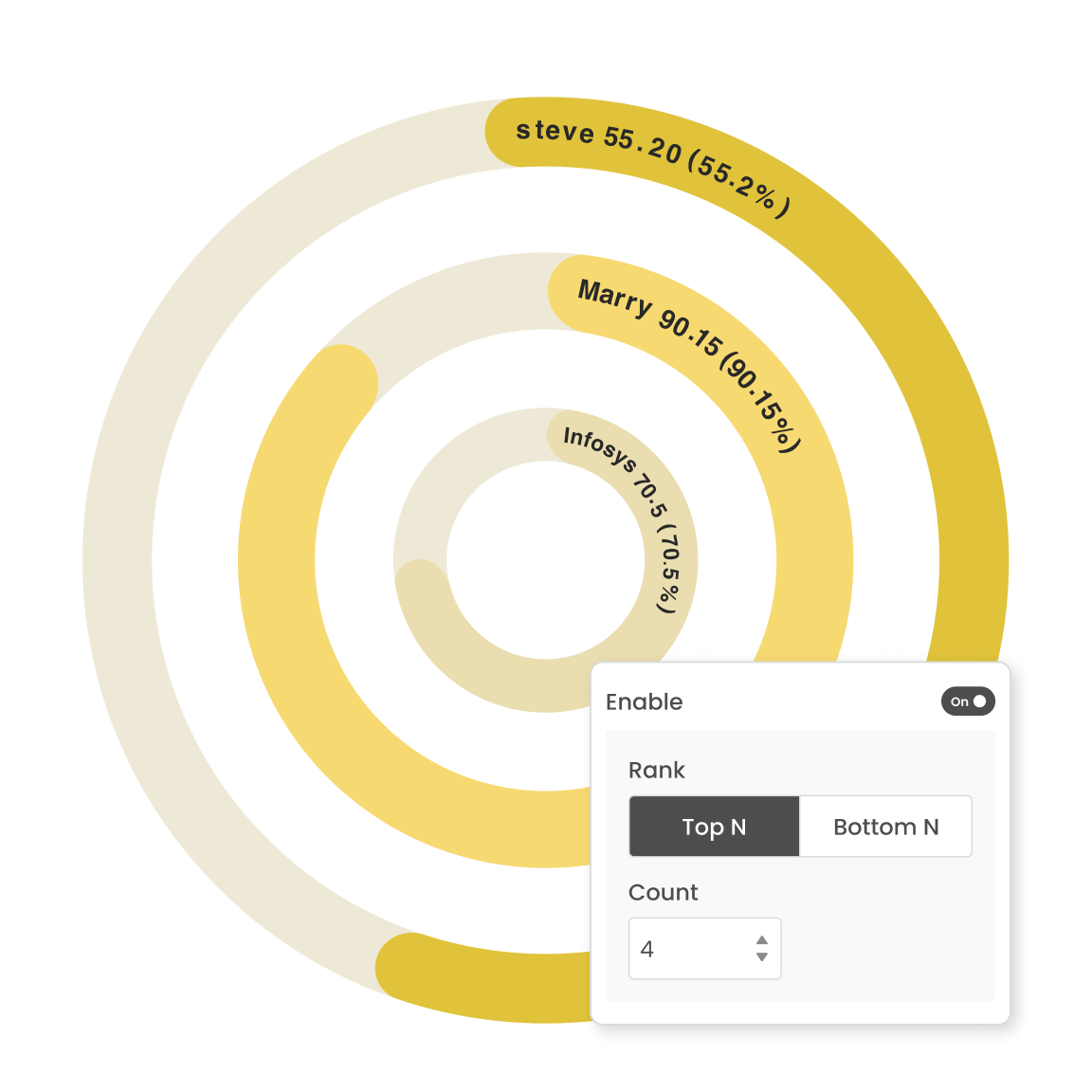
Filter out Top/Bottom N by each level. Either hide or show the remaining categories as "Others".
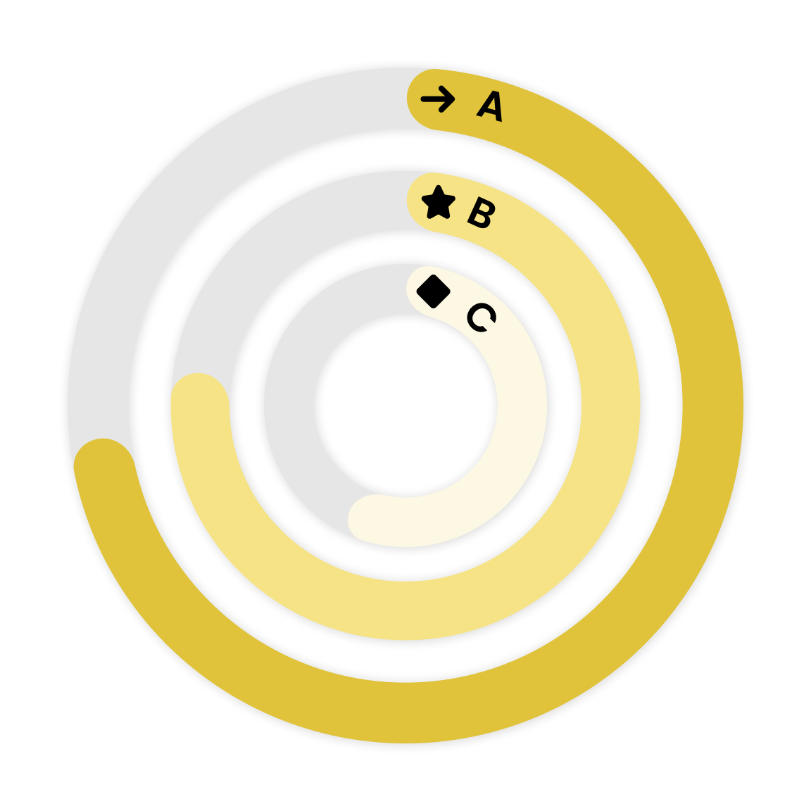
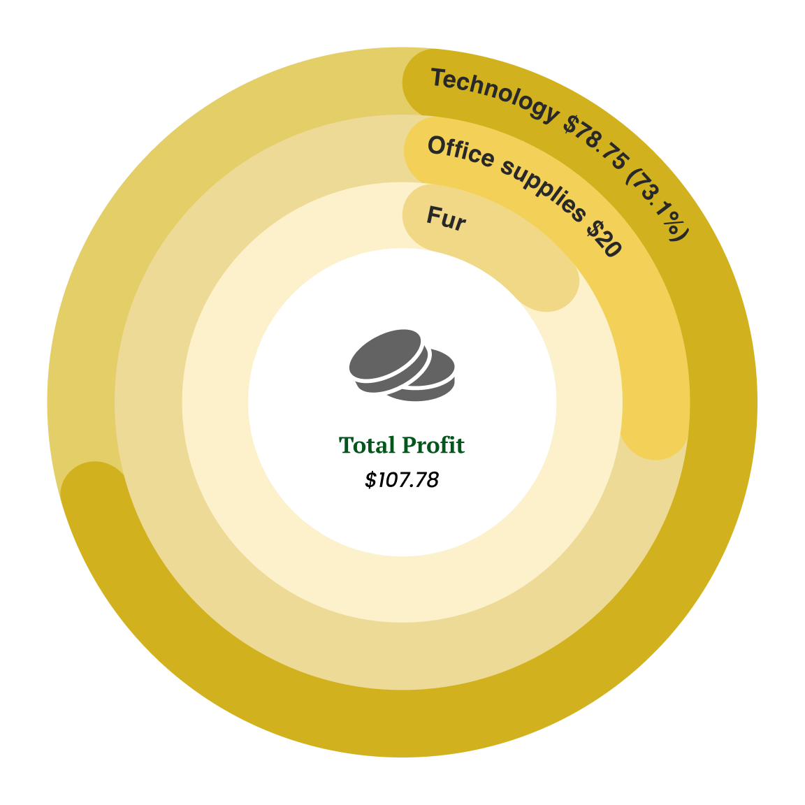
Use a combination of text, measure, icon, and uploaded images to style the center area of the Activity Gauge.
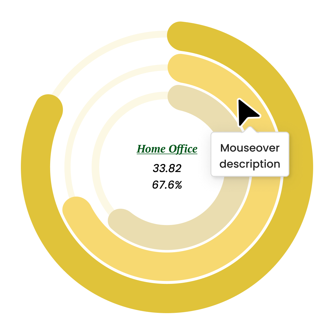
Powerviz allows the user to see dynamic details in the center by hovering over the arcs.
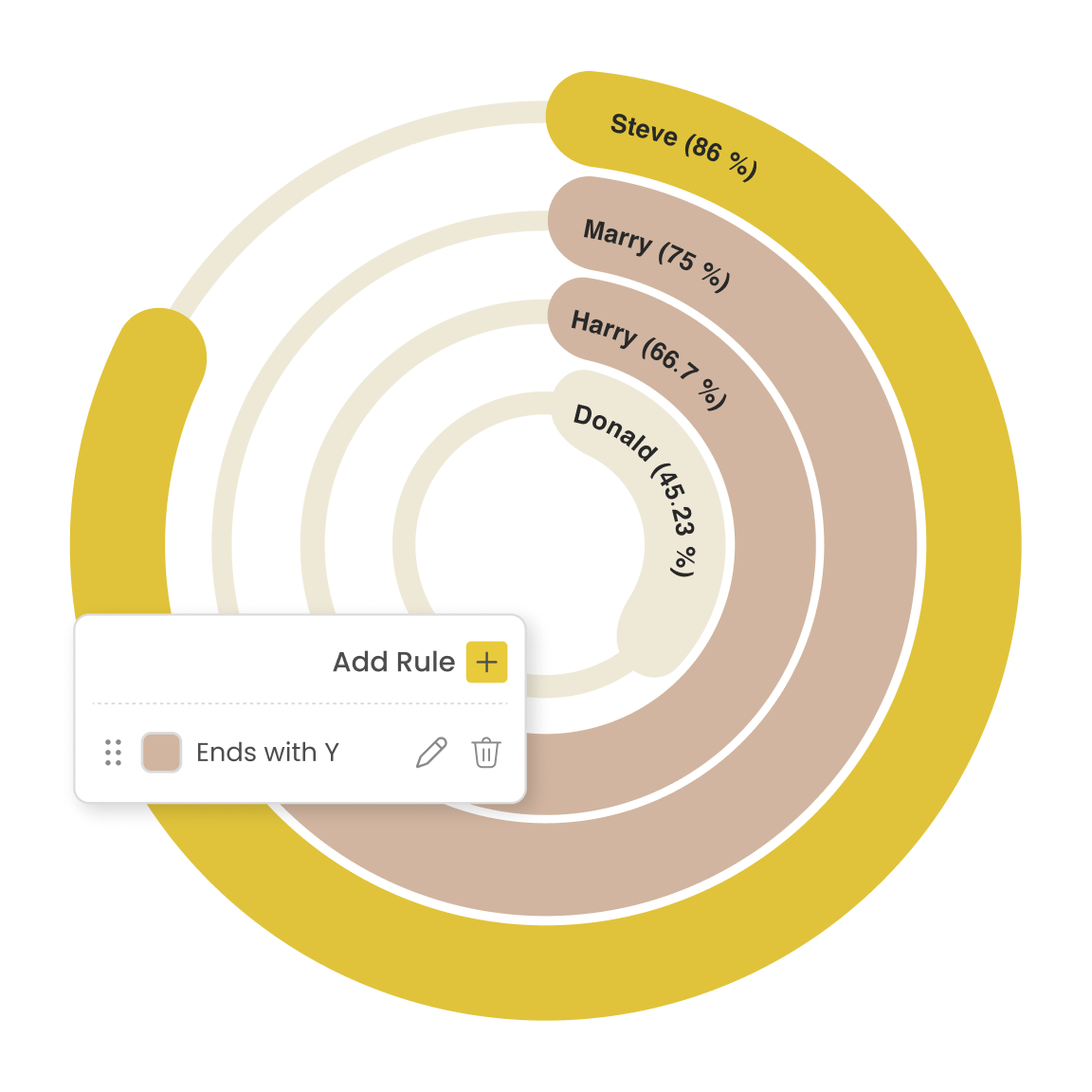
Easily detect outliers or patterns using conditional formatting. Set rules by measure and category without any DAX.